Lasercut DnD Condition Rings

Here’s another recent project I did for DnD. There are various conditions that characters can get in the game. For example you might be hit by a spell and end up paralyzed. Or ‘Charmed’, which can basically mean you can attack anyone except the person who charmed you.

Tracking those conditions & remembering their effects each turn can be tricky. Especially if the DM is running a lot of things simultaneously.

Here’s my version. They’re lasercut acrylic rings, that can either be draped over a miniature or put around the base:
Condition rings closeup v01I polled my various DMs to get their opinions on which conditions which were most important, as well as required quantities of each ring. I did the design using Python and Jupyter notebooks. I wrote some code to make the shapes, write the text in a different colour, and put the variable diameter outline in place. To my mind that’s the killer feature, as the rings take up as little space as possible during both storage & play.

I came up with a good method of fairly quick mass production. First step was to lay some masking tape down on the lasercutter bed, and score the dimensions of the stock onto it. That way I could reliably line up the piece later.

Next, I engraved the text with the laser, and then rubbed ordinary acrylic paint into the pits left behind. This leaves a beautifully vivid colour inlay that is hard to get any other way.

Painting v01

The excess paint is wiped off, and the material is transferred back to the lasercutter for final cutting.

After cutting v01

The entire set fits together neatly into a plastic storage tray.

Finished rings Closeup v01

Files here for anyone that wants to make their own:

https://www.thingiverse.com/thing:6190669

Posted in Uncategorized | Tagged | Leave a comment

The Druid WildCase – A totally unnecessary addon for DnD

Here’s a fun and over the top project I recently did for Dungeons and Dragons (DnD). 

One of the options for players is to be a Druid, which grants a “Wildshape” ability and allows you to turn into various animals for a limited time (The recent movie has the Druid character using this at every opportunity). 

Since painting miniatures and going over the top is part of the fun of playing the game, I decided to see if I could make a complete set of all the animal forms available to the druid. 

Wildcase front v02

The first step was to get a list of beasts. I found this excellent spreadsheet by reddit user SpiralOut154:

https://www.reddit.com/r/DnD/comments/jd4718/druid_wild_shape_beast_list_updated/

With that as a starting point, I began checking off models that I had either already purchased, or printed:

Spreadsheet image v01

My sources of models through this project were, in order:

  1. Gumtree (Craigslist Equivalent) – 

With a bit of searching, you can often find people selling away their whole collections in one cheap lot. About a year ago I found someone who sold me around 300 miniatures, a ton of scenery, books, around 80+ paints & more for $400AUD. 

 2. Wildspire Minis 

They have a wonderful selection of cheap, bulk minis available. I bought a couple of bulk sets to practice painting. As a newbie painter, it was a great help to be able to practice basic skills without worrying that I’d destroy a $20 mini.  https://www.amazon.com/stores/WildspireMiniatures/page/B343BFEF-3714-440E-9750-50FC66D51848?ref_=ast_bln

3. The designer known as “mz4250” https://www.patreon.com/mz4250  and on shapeways & elsewhere. 

I came to them late, but they were my best source of everything by far. Even when I already had a miniature from elsewhere, I found myself using their STLs as an aide to figure out, say, how much space a brown bear takes up. 

Now that I had a full set of around 100 STL files, I realised that I had a couple of big challenges on my hands. 

First challenge was how to keep the set organized when I’d finished. I want the collection:

  • To be portable, so I can take it to the pub or wherever we’re playing. Should be robust against being carried on public transport, and lugged across the city. 
  • To exhibit what Adam Savage calls “first order retrievability”. No moving things to get to other things. 
  • To be visually obvious where everything goes, aka “Mise en place”  
    • If a stranger borrows a model, it should be easy to find and remove, and 
    • When returning it should be easy to spot where it should live. 
    • Likewise, I want to be able to tell at a glance if anything’s missing and I need to go search nearby tables for a figurine.

The second challenge was more about mental energy. 

Printing can often be a frustrating process, so I wanted a way to feel that the collection was growing, and give me the motivation to keep on loading files and printing.

I decided to use metal trays in a lasercut box, and make a paper inlay to show what model goes where. (I already use magnets on all my models so they stay in place for storage). That way as each model is printed, you can see the space get taken up, and get that urge to complete the set and fill everything.

The question was how to make a picture of each model for the paper inlay. I didn’t fancy freehand sketching 100 different animals, and I also wanted to know the exact size of the models, and not just make a rectangular approximation. 

Then I realised that the solution was already in the 3D STL models of each animal. I wrote some python code to open each file, look at the XYZ coordinates, then discard the Z (making the silhouette). 

WildCase system detail v01

Plotting this gives the visual equivalent of an X-ray, or CT scan because, well, that’s kinda what it is doing. 

My code printed this to an image as a bitmap, but more importantly it figured out the convex hull of all the XY coordinates, to determine the closed “footprint” of the object, and saved that as a vector shape in the same file. 

I then exported them all to SVG files, and spent a while in inkscape rearranging the shapes across my different trays. 

Wildcase tray v01

By making sure each paper inlay has a dark background, you can see at a glance which models are missing; 

Wildcase tray missing v01

And the entire set fits in a lasercut plywood case for easy travel. An acrylic lid goes on the front to keep dust away and stop anything from getting lost. But the main beauty of this is the magnets that hold everything in place: 

The robustness of the magnets can’t really be overstated: 

Wildcase tilted v01

I still haven’t quite finished printing yet, but I’m getting close. It’s been a very fun project and gotten some good use at the pub. 

Files are here for anyone that wants to make their own: 

https://www.thingiverse.com/thing:6098991

Posted in Uncategorized | Leave a comment

Lasercut DnD Scenery

Here’s a design I made recently for Dungeons and Dragons scenery using a lasercutter.

I created a bunch of tiles based on a standard 25.4mm grid. The walls are made from two layers of 3mm plywood back-to-back, which allows both sides to be laser engraved easily. The floor is made from 7mm plywood, but you could easily adapt the design for thinner material if your laser is less powerful.

There’s some nifty features, like portcullis doors that can really open, and mysterious portals with different colour inserts. Walls are deliberately around half-height, so that players can see the pieces more easily from all around the table:

Terrain closeup v01

IMG_1732

For the brick coloured walls I used a very light spray of “Rust Guard Quick Dry”  in “Terrain” colour. And for other pieces I used Burroughs (knockoff Copic Markers) alcohol markers and just coloured the wood in. The result is good enough for my lazy self:

Fire closeup v01
IMG_1733

Here’s all the parts laid out:

Parts array 1 v01 Parts array 2 v01

The entire kit fits in a single case for travel:

Storage case v01

I was very happy with it, but a week later I had a much better idea for how to make pieces, so I actually won’t end up using this type after all. Hey ho.

Files here for anyone that wants to make their own:

https://www.thingiverse.com/thing:5791334

Posted in Uncategorized | Leave a comment

Roadside Picnic – A Nitpick on How to Shoot the Earth

This blog post is all about a line from the Russian scifi novel “Roadside Picnic“, written in 1971 by the Strugatsky brothers. The book itself went on to influence huge amounts of science fiction and cinema, including the 1979 film “Stalker” by Tarkovsky. (And later a number of video games along the same lines).

The rough premise of the novel is that Aliens have briefly visited earth, before departing again. We get this beautiful framing of the Aliens from the learned professor character:

A picnic. Picture a forest, a country road, a meadow. Cars drive off the country road into the meadow, a group of young people get out carrying bottles, baskets of food, transistor radios, and cameras. They light fires, pitch tents, turn on the music. In the morning they leave. The animals, birds, and insects that watched in horror through the long night creep out from their hiding places. And what do they see? Old spark plugs and old filters strewn around… Rags, burnt-out bulbs, and a monkey wrench left behind… And of course, the usual mess—apple cores, candy wrappers, charred remains of the campfire, cans, bottles, somebody’s handkerchief, somebody’s penknife, torn newspapers, coins, faded flowers picked in another meadow

And the novel, set 30 years after the visitation, covers the lives of the various people who now live in a world with dangerous and incomprehensible artifacts, originating in these bizarrely contaminated “zones”.

The quote in particular that I was struck by is this (emphasis mine):

“The Pilman Radiant is simplicity itself. Imagine that you spin a huge globe
and you start firing bullets into it. The bullet holes would lie on the surface in a smooth curve. The whole point of what you call my first serious discovery lies in the simple fact that all six Visitation Zones are situated on the surface of our planet as though someone had taken six shots at Earth from a pistol located somewhere along the Earth-Deneb line. Deneb is the alpha star in Cygnus. The Point in the heavens from which, so to speak, the shots came is the Pilman Radiant.”

and later on (emphasis mine):

“It suddenly occurred to me that Harmont and the other five Visitation Zones — sorry, my mistake, there were only four other sites known at the time — that all of them fit on a very smooth curve. I calculated the coordinates and sent them to Nature.”

at first glance that seemed to make perfect sense to me. I could imagine in my head a diagram much like this one, which shows the ecliptic and the tilt of the earth offset from that. What could be more natural than for an external celestial event than to lay upon a Great Circle path across the Earth?

587px-Earths_orbit_and_ecliptic

But the more I thought about it, the more I realised that it doesn’t make sense. If you fired shots from Deneb at Earth, then there’s no reason why they actually need to lie on any single curve.

There’s at least 3 ways I can think of to interpret the professor’s discovery.

The first way is that all three shots were fired at the same time, and they happened to intercept Earth. (i.e. they were not aiming at Earth’s centre of mass or anything). This makes most sense if the aliens didn’t even stop, and the unearthly condition of the “zones” is just what happens when ships powered by some reality-alterning warp drive technology passing through ordinary matter.

Roadside picnic interpretation 1 - v01

This would result in 6 sites, all along parallel lines. However there is no curve which explains or allows you to predict the others. (Hypothetically, if you knew about site E, F & D, this would allow you to calculate C. However A & B would not be determinable without knowing at least one of the pair. )

So this interpretation is not a good fit for the story.

The second way to interpret the scientists words are that all the “shots” were aimed at the centre of the earth, but fired at different times. This is consistent with the mentions of spinning in the description. And perhaps the alien technology relies on using the earth somehow. (e.g. they need to aim the teleporter at our gravity well, or something) The results would look like this;

Roadside picnic interpretation 2 - v01

This would result in all the sites having the same latitude North or South. All the “entry wounds” would be in one hemisphere, and all the “exit wounds” would be in the opposite hemisphere.

However this doesn’t fit the story at all, since all the sites having a common latitude is not something you need to do any indepth calculations on, or fit a curve to. And there’s no real need to write to Nature to inform them of your amazing discovery, since everyone with a table of the coordinates would immeidately see the pattern themselves.

The third way to interpret the scientist is this. The shots are fired at different times, and intersect the earth without being aimed at the centre. This results in all the lines having the same angle to the axis of Earth’s rotation, but that’s about it:

Roadside picnic interpretation 3 - v01

There’s no curves, or great circle routes, or really anything you can do with this model. True, if you were informed of the location of a new site [and the time of the hit], it allows you to infer that there is a sister site on the other side of the planet to investigate. But that’s not the sort of calculation the professor described.

My conclusion is either;

  1. This was something quickly thought up for a scifi-story, and 50 years later I’m over-analyzing it.

2. The Dr Pilman character made a mistake. And that his greatest achievement “The Pilman Radiant” is actually a coincidence or misinterpretation, and humanity knows less than we think about the aliens visitation. In fact, given how apathetic and nihilistic his character is about the whole situation — He says at one point that most important discovery that Humanity has made is just that the visitation has occurred. And that it’s not important who they were, or where they come from, etc. — I think he would be rather delighted to know that his main idea is wrong.


Edit — 1 hour after posting the original. Jess and Scott helped me realise that if there was a laser beam stretching across the cosmos, and Earth “wandered into” that beam as part of its orbit around the sun, then it would indeed make a smooth curve. 

So if we have the point of view of the “giant matter transmitter canon” on Deneb, and Earth moves into that beam from left to right: 

Roadside picnic interpretation 4 - v01

Then subsequent shots will hit the earth at the same angle, and different latitudes, and the longitude will depend on how far the Earth has rotated in the day/night cycle compared to how fast it moved in the annual orbit around the sun. 

Roadside picnic interpretation 4b - v01

If we look up the speed of the Earth at the equator, it’s about 0.47km/sec. And the speed that the Earth orbits the sun is around 30km/sec. So clearly the picture on the right is much closer to the truth. 

Darn. So the events described in the novel actually make sense. I’m kind of disappointed. 

Posted in Uncategorized | Tagged | Leave a comment

Backrooms Async Lab Diorama – One Day Build

Here’s a quick one day build project, inspired by Kane Pixel’s awesome youtube channel, and this video in particular. 

I lasercut the enclosure out of 7mm plywood. And used cheap adhesive acrylic mirrors on all four sides of the inner room. Then I lasercut some textured wallpaper pieces, and spent a bit of time arranging them carefully so that no matter what angle you view it from, you can’t see the entry threshold inside. 

The lighting inside is neopixel (WS2812) controlled by an arduino nano. I used blue lighting for the “lab” section and yellow lighting for the backrooms, but it’s all controllable. I was going to add fluorescent flicker to the yellow portion, but wasn’t sure if that was cannon or not…

Shoot me an email if you want the files to make your own. 

Posted in Uncategorized | Leave a comment

Do flat tyres make your speedo lie? (Part 2)

OK, I decided to do a bit more testing, using the CANBUS data of the car, given that a few people have pointed out that “Indirect TPMS” (Tyre Pressure Monitoring Systems) exist, and use the ABS wheel encoders to infer if a tyre is flat. I was really puzzled by these systems, since it looked like my first round of tests proved that (on my tyres at least) it shouldn’t work.

(In theory Indirect TPMS also uses Fourier analysis of the encoder data to look for resonance. Which I’m sure exists. But I’d be fairly skeptical that normal tyres show enough of a radius change for flatness to be reliably detecting without looking at Fourier stuff)

I did two runs. One with all tyres full, and the other with the rear-left tyre deflated to 150kPa (65% of normal pressure). That level is low enough that I can feel a fairly strong pull as the car “wants” to go to one side, but it’s high enough that I can be fairly sure my experiment won’t break my tyres and cost me money…

I made sure to take the same route, starting and ending point, and used a stretch of road that was quite straight for most of the way. CANBUS frames were logged to my laptop, then decoded in Python.

Here’s the results. As you can see there’s only fairly subtle differences in the speed, but it’s very hard to tell when compared with the speed differences that occur during turns:

Tyre speeds - full v01

Tyre speeds - flat v01

A better way to analyze it is to compare the ratio of the wheels (Front Left / Front Right), and see how that varies when compared to the steering wheel angle. Thanks to the CANBUS data I can easily plot that and see where the centre of mass of the data points is:

Ratio of wheel speeds - full v01

Ratio of wheel speeds - flat v01

You can actually see that there probably is a difference, but it’s a damn subtle one. Deflating one tyre almost enough to be a safety issue caused maybe a 1% difference.

Realistically I should do this several times to average out and see if the effect persists. This test involved me driving down the street and having to wait for traffic and lights, with lots of interruptions and turning around. So maybe the results would be different if performed again. But I’m happy to have narrowed down the size of the effect (if any) to be very small.

Posted in Uncategorized | 1 Comment

Do flat tyres make your speedo lie?

This is a question that I’ve seen debated a few times, both in person and on the internet. It’s not quite in the same league as the immortal argument starter “airplane-on-a-treadmill”, but it has many of the same features.

To be clear about what I’m talking about, the question is whether having either flat or overinflated tyres would cause your car’s speedometer to display a significantly incorrect value (let’s say at least 5%). I’ve seen people advocating that people need to check their tyres, otherwise they could get false speeding tickets. For the sake of this discussion we’ll consider the simple case where the vehicle is traveling in a straight line, and the tyres operating with constant contact with the road, with no slip. Cornering and such will be left out.

At the heart is a couple of conflicting intuitions as to what happens.

The first intuition is that the height of the tyre, and hence the radius, will change as air pressure changes.
Intuition 1 change in radius v01

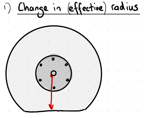
The second intuition is that regardless of the radius of the tyre, the circumference stays the same. And since each part of the tyre rolls against the ground, it doesn’t matter if it’s smushed down into a tank-track, the length covered by one rotation stays the same:
Intuition 2 constant circumference v01

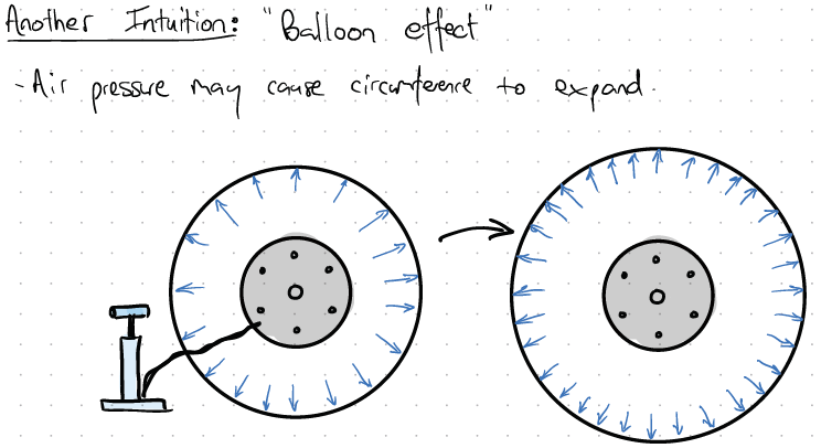
The third intuition of interest, is that the tyre will physically stretch as more air is inserted, thus changing both the radius and circumference:

Intuition 3 Balloon effect v01

These intutions pull in different ways, and focusing on only one can lead to the conclusion that the answer is easy and obvious. I was kinda fed up with seeing people on the internet arguing about it, and basically no-one doing the actual test. So I decided to do my own experiments and see what the results were.

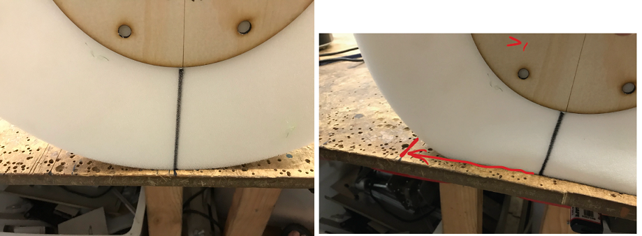
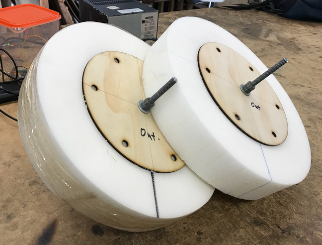
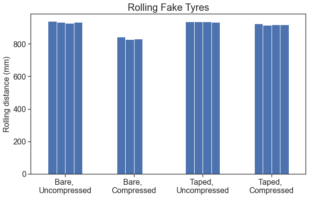
I started by making a simple model to test the assumptions. I used a hot wire cutter to make two foam discs, and used a lasercut circle of wood in the middle as a hub. I then marked out a line on the edge, and measured how far it takes the tyre to roll one revolution along the table. As I thought, the results were significantly different if the wheel was “smushed” down by pressure, than if the wheel was rotating with no load:
Foam tyre compressed v01

But then I realised that modern tyres have steel bands “radials” in them, which act like the hoops on a barrel, and prevent expansion. So to replicate this, I wrapped one of my fake tyres in packing tape (which has amazing tensile strength):
Prototype tyres v01

When I did the tests again, I could clearly see that the difference between a loaded and unloaded tyre almost disappears:
Rolling fake tyres v01

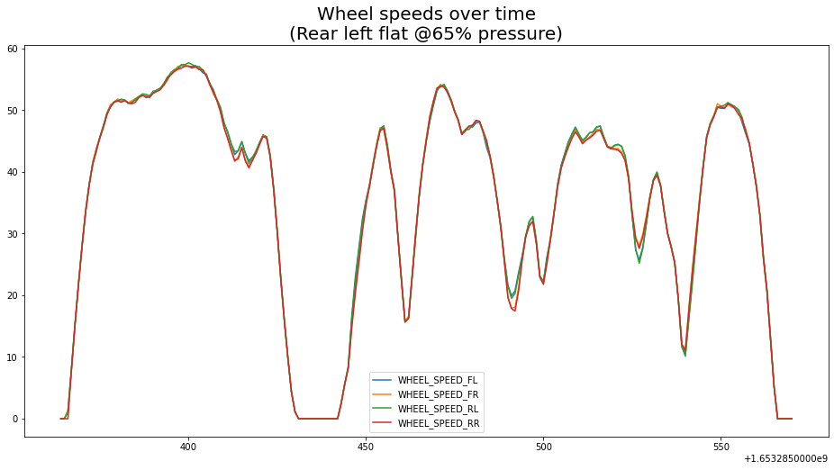
So, does the real car behave in the same way as the fake tyres? In order to test this I needed to measure the car’s reported speed (from the speedometer), as well as a source of ground truth. I spent a while trying to get OBD-II data decoding on my car working well enough to log directly, but found it very frustrating dealing with the various devices.

I then realised that I was over-complicating this, and with a bit of searching I found an app for my phone that put a GPS overlay onto the camera feed. Then all I needed to do was tape my phone pointing at the speedo, and drive around. Then I could later look at any frame of the video and have a synchronized readout of both gauges.

(I’ve since figured out what I was doing wrong, and realised that rather than dealing with OBD protocols, I can sniff data directly from my car’s CANBUS at much higher rate. But the rest of this analysis is done with the video data).

I decided to try several “runs” in the car, with the tyres at various pressures far below and above normal ratings. My car is 230kPa, so I tried every pressure from 150-275kPa in 25kPa increments. This represents 65% to 120% of normal. (I didn’t really want to go much underneath 150kPa, as the tyres already looked fairly saggy to my eyes, and I didn’t want to risk damaging them and needing to buy a full replacement set).

I decided on a nice, fairly straight stretch of road with a high-ish speed limit ( 70km/h), with a service station at each end. That way if I had a problem with leaks or flats something I’d never t be far from help. Before each run I raised or lowered all four tyres to the same pressure, confirmed it with a handheld gauge, and drove, making sure to consistently record from the same starting point. Speed during the run will vary because there were a couple of traffic lights on the route, but I tried to stay just below the limit at a nice constant 60km/h to get as close as possible to measuring steady state.

After recording all the videos, I went back to the computer and started looking at the footage. Straight away I realised that it’s quite annoying to constantly pause and unpause video to make notes. Also it’s very difficult to pause at a regular gap (e.g. every 2 seconds), and by doing so I’d be introducing a lot of uncertainty into the measurement. This was a problem because there’s obviously a lag between the car’s speedo and the GPS, that I need to correct for.

To get good raw data out of the video, I used the free software “ffmpeg” in order to automatically “slice” the video at regular intervals into a folder full of still frames. According to my notes the magic incantation I used was:
“ffmpeg -i video_150kpa.MOV -filter:v fps=fps=1 ffmpeg%03d.png”

I then sat down in excel and transcribed the images to a spreadsheet. Once I had that I could analyze it in Jupyter notebooks with Numpy, Pandas, and Matplotlib.

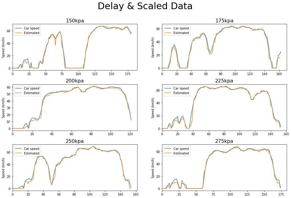
The first problem was that there is clearly a scaling issue, as welll as a delay between the speedo velocity and the GPS. (Not unexpected, GPS tends to lag since it relies on calculation of recieved signals).
Scaling error v01

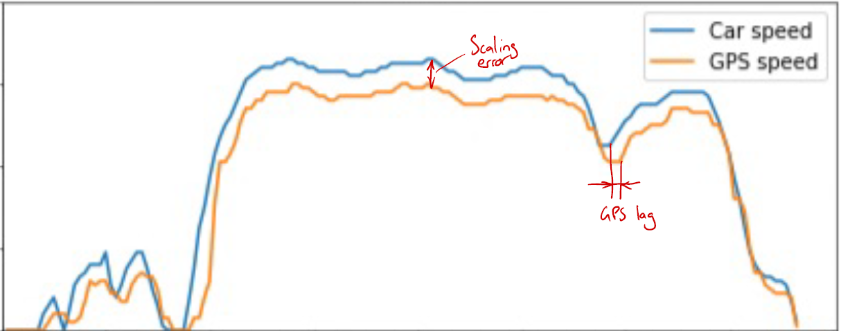
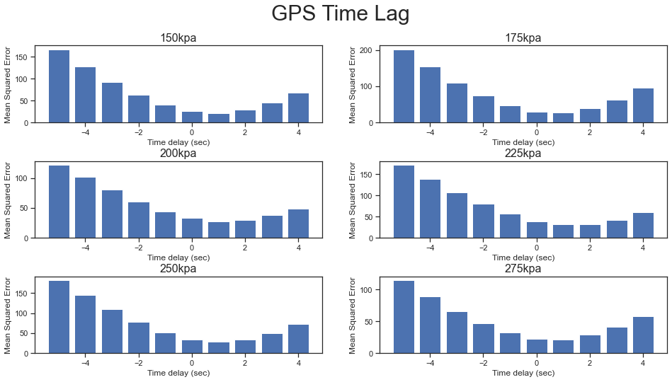
I calculated the mean squared error of the signal after applying various amounts of delay. You can see it’s quite consistent at 1sec for all the runs:
GPS Time lag v02

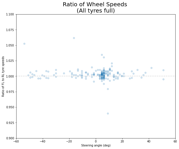
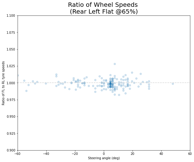
The second bit surprised me, the scaling always seems to be off by around 11%.
Speedo scaling v02(Later, when I analyzed raw CANBUS frames from the vehicle, I could see the speedo CANBUS values are actually different from the indiviudal tyre speed CANBUS values by a nice round 10%. I strongly suspect Toyota makes the speedo intentionally read exactly 10% fast to encourage more economical driving).

At any rate, if we now replot the data using the values of 1sec delay and 110% scaling, we can see the following:
Delayed and scaled data v01

I can’t see a difference in the above plot. But just to be sure, here’s a heatmap of all the data points, with GPS speed vs speedo speed. The diagonal line is the expected correlation, and the outer two lines are 2% higher and lower. You can see that vast majority of the data’s mass is within +-2% of the expected value.
Heatmap plot v02

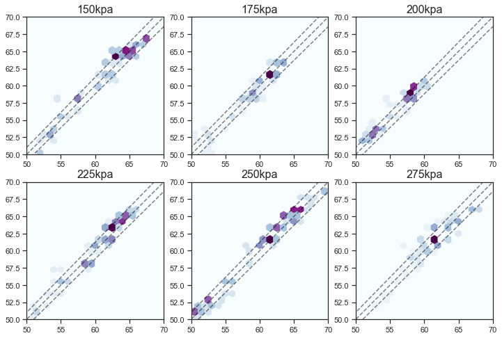
So it looks like there’s basically no difference between ridiculously flat and ridiculously inflated tyres as far as your speedo readout goes. Maybe other tyres would behave differently, but I doubt it.

This was a fun experiment to do, and it didn’t take more than a couple of evenings.

[Edit; I now have done more tests in Part 2!]
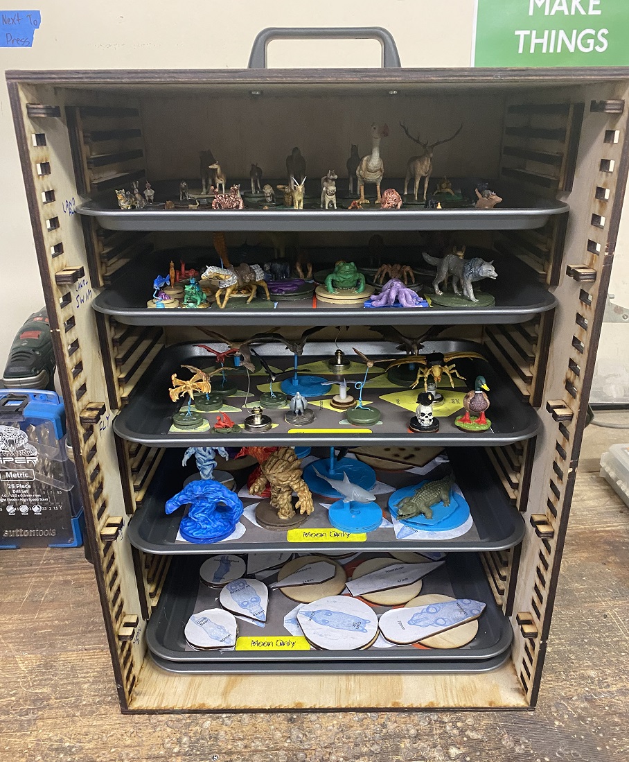
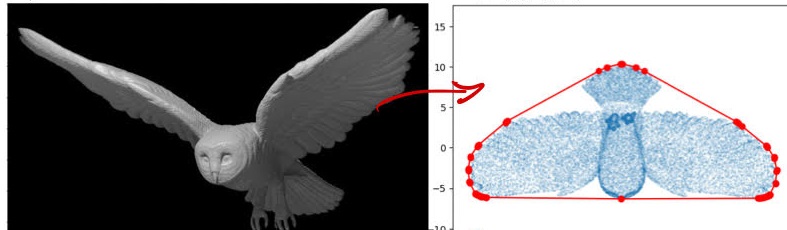
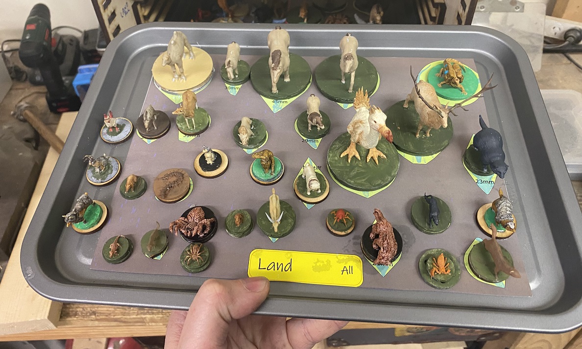
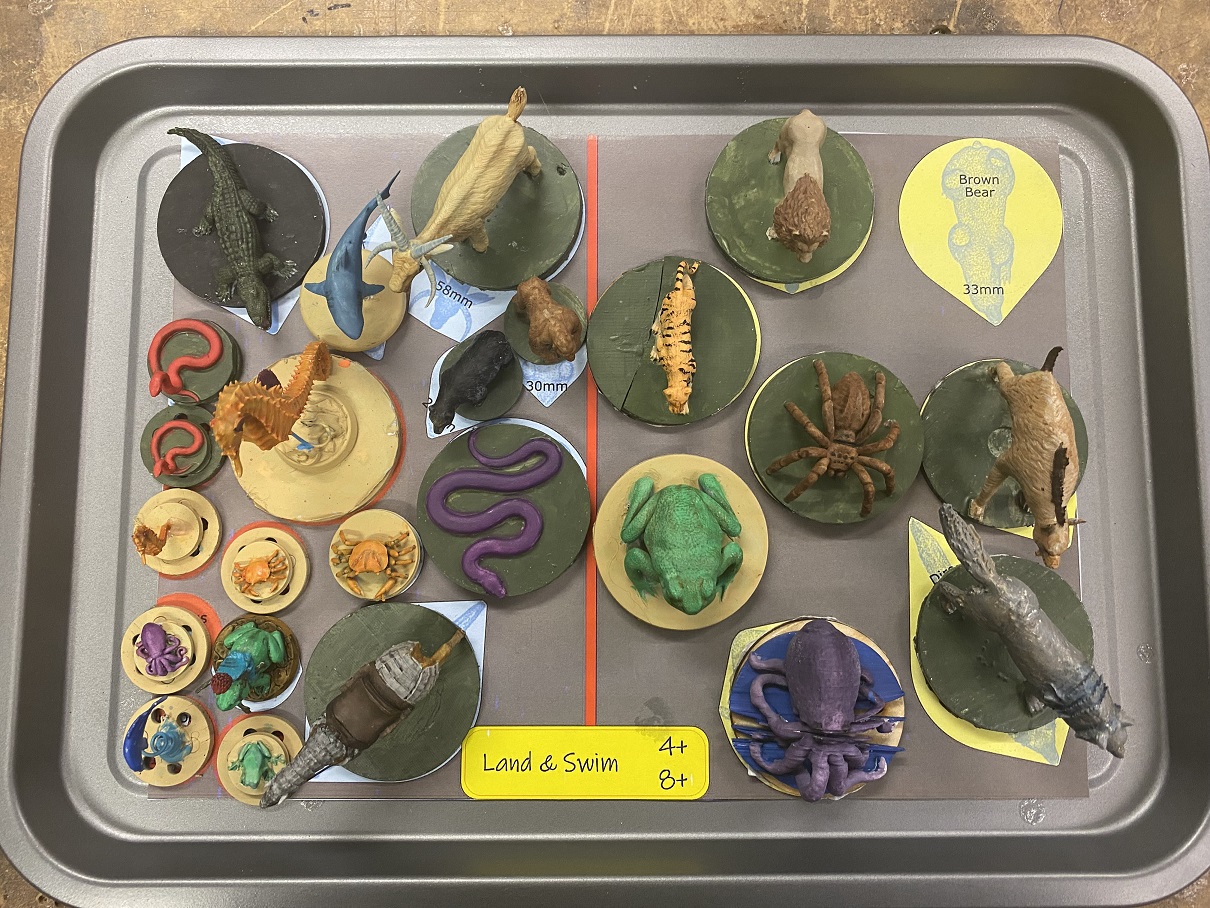
Posted in Uncategorized | 2 Comments

Display box for a KP1-4 High Voltage Variable Cap

I was recently at the Central Coast Amateur Radio Club’s annual get together. And I saw this beautiful glass vacuum tube there.

It’s a vintage Russian KP1-4 high voltage capacitor. Basically two metal plates in a vacuum separated from each other by a small distance. What makes this unit cool is that it has a dial on the top to allow you to vary the spacing, and hence the capacitance. There’s some flexible vacuum bellows, and a leadscrew to allow you to change what’s inside the high vacuum glasswork without breaking the seal.

I figured the unit was going to be a bit fragile to have on the shelf by itself, and also tricky to connect to if I wanted to experiment. So I made this lasercut plywood box to hold it, and have acrylic windows to stop prying fingers getting near the HV. There’s a pair of connectors on the side so it is somewhat functional. (Although I’m sure the bandwidth of my banana plugs would be terrible if I actually tried to use this for radio stuff).

Interestingly I can’t see any “getters” inside the vacuum enclosure. Perhaps there is a hidden one, or maybe it’s just that as the whole assembly stays cold (no thermionic emission), it is less sensitive to bad vacuum than other tubes are.

Posted in Uncategorized | Leave a comment

Spiral Music Visualization using Teensy or Python

Here’s a project I finished a couple of years ago, but never got around to posting.

It’s a way to visualize music differently to the standard notation. The notes are wrapped in a spiral fashion, with one rotation per octave. (e.g. all ‘C’ notes are at 12 O’clock)

There are a lot of benefits to seeing the music this way:

  • You can see an entire orchestra “Cooperating” to make a chord, without having to read 6 sets of sheet music at the same time.
  • It makes it extremely easy to see transpositions (they’re just rotations)
  • Melodic inversion is just a mirror flip
  • Notes played stay visible for a time as a ‘histogram’. This makes it easy to see the Key signature
  • Different instruments (midi channels) are different colours. Can see contributions of each instrument to the whole

Here’s the github repo for the hardware version:

https://github.com/mechatronicsguy/SpiralMusic_Teensy

Hardware of the spiral visualizer – Uses Teensy 3.6 for everything and acts as both MIDI input & output devices.
(Ignore the letters on my keyboard. It was a joke from a previous project)

And just recently I decided to make a software only version, so I didn’t have to drag out the hardware each time. Here’s the github repo:

https://github.com/mechatronicsguy/SpiralMusic_python/blob/main/README.m

Posted in Uncategorized | 7 Comments

Origami Maths – Face Graph of a Hypercube

Here’s a quick little project I never got around to writing up. A while ago I was doing a dive into group/category theory and playing around with graphs of various polytopes. I wanted to make a model of the faces of a hypercube.

I tried a couple of different models, using pipecleaners & straws, then another version with lasercut wood struts and cable ties. Eventually I settled on this method, just using string and lasercut cardboard:

Face graph of a hypercube, done in origami and string style

Of particular interest, is that all the vertices look the same, in terms of having the same connectivity. (Not too surprising, but hey).

Posted in Uncategorized | Leave a comment